Floral texture choice explained: a designer's guide
Texture is the surface quality of a flower, foliage, or container, perceived both by touch and by sight, and it is the element that separates a flat, forgettable arrangement from one that genuinely holds attention. Florists’ Review describes texture as “the richness of design,” the quality that draws the eye through contrast of tactile surfaces. When you understand how to explain floral texture choice, you stop picking flowers by colour alone and start building compositions with real depth.
What floral texture is and why it shapes every arrangement
Texture in floral design covers both the tactile feel and the visual surface quality of flowers, foliage, and containers. A petal can look rough from across the room and feel silky to the touch. That gap between appearance and reality is exactly what makes texture so interesting to work with.
Texture contributes four things to an arrangement:
- Depth. Rough surfaces appear to advance visually; smooth ones recede. Placing a coarse bloom at the centre pulls the eye inward.
- Contrast. Juxtaposing opposing surfaces, such as a glossy anthurium against feathery astilbe, creates visual tension that energises the whole piece.
- Balance. Coarse textures carry more visual weight than fine ones, so their placement affects how stable an arrangement feels.
- Mood. Silky textures suggest gentility; velvety surfaces read as opulent; prickly thorns communicate something altogether more dramatic.
Texture also interacts with colour. Shiny leaves placed next to flowers intensify those flowers’ colour by reflecting light onto them. Finely textured blooms make colours appear softer and more diffuse.
The main texture types and which flowers carry them
Recognising texture categories is the first practical step in choosing floral textures with intention. Here are the core types, each with real examples:
- Smooth and silky: tulip petals, sweet peas, garden roses
- Velvety: pansies, black-eyed Susans, celosia
- Glossy or waxy: anthuriums, magnolia flowers, camellia leaves
- Rough or coarse: dried lotus pods, knobbly gourds, teasel heads
- Spiky: Araucaria, sea holly (eryngium), allium
- Fine and feathery: astilbe, gypsophila, fennel fronds
- Ridged or corrugated: Peperomia leaves, Begonia masoniana, artichoke heads
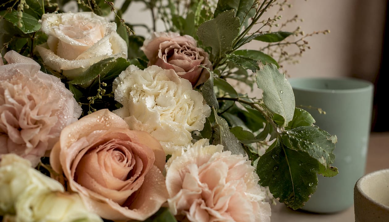
One detail worth knowing: a carnation’s ruffled petals look visually rough but feel smooth to the touch. Texture perception shifts with light and angle, so always assess stems in the conditions where the finished arrangement will actually sit.
Pro Tip: Turn leaves over before discarding them. The reverse side of many foliage stems carries more compelling texture than the front, a subtle technique that adds complexity without adding cost.
How to build dimension by layering and mixing textures
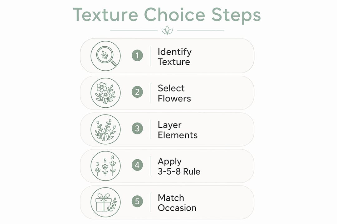
Mixing contrasting textures is the most direct way to add vitality to a design, but the method matters. Follow these steps when building a textured arrangement:
- Choose a dominant texture first. One surface quality should lead; the others support it. A design without a dominant texture reads as confused rather than rich.
- Introduce a contrasting texture. Pair your dominant surface with its opposite: rough against smooth, dull against shiny. Combining rough and smooth creates tension that captivates the viewer without overwhelming them.
- Distribute textures to create rhythm. Repetition of a texture across an arrangement encourages the eye to travel through the design rather than stall at one point. Place the same textural element at three or more positions to establish that rhythm.
- Use texture to control visual weight. A shiny leaf placed centrally in a traditional design adds the visual weight needed to anchor the composition.
- Let texture reinforce colour. Where your palette is neutral or monochromatic, sharp contrasting textures prevent the design from looking dull. A muted dried arrangement, for instance, needs strong textural contrast to carry any visual interest at all.
Pro Tip: In a modern or abstract design, exaggerate the contrast deliberately. Fewer stems with no transitional material between them lets each texture read clearly, which is exactly the point in contemporary work.
Common mistakes to avoid when selecting textures
Most texture problems in floral design come down to one of three errors.
- No dominant texture. When every stem competes equally, the arrangement has no focal point and the eye has nowhere to rest.
- Ignoring proportion. Coarse, heavy-looking textures placed at the outer edges of an arrangement make it feel top-heavy. Scale your texture choices to the container and the setting.
- Mismatching texture to occasion. Rough, dramatic textures suit contemporary or wild garden designs; they jar in a sympathy tribute where soft, fine surfaces better serve the mood. Seasonal availability shapes which textures are genuinely accessible, so build your palette around what is actually at peak quality.
- Overlooking foliage. Foliage is not filler. Glossy Magnolia leaves, felted Kalanchoe, or the corrugated surface of Peperomia each bring a distinct textural note that flowers alone cannot replicate.
Advanced design: the Florist’s Choice approach and the 3-5-8 Rule
Two principles separate competent texture work from genuinely polished design, highlighting the impact of floral designer creative freedom on bouquet cohesion as explored in floral essential oils benefits list for natural wellness.
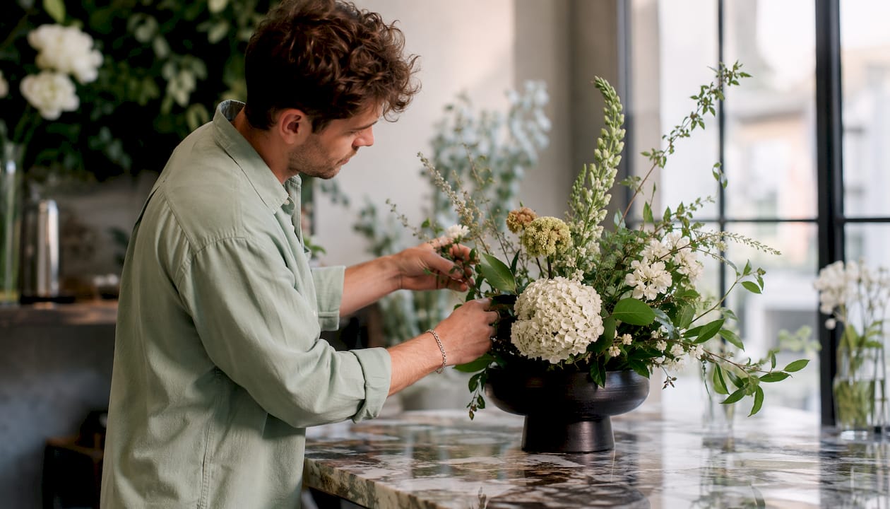
The Florist’s Choice approach gives the designer freedom to select the freshest, most texturally interesting stems available that day, unconstrained by a fixed catalogue. The result is arrangements built around what is actually at peak quality, which tends to produce the most cohesive and painterly work. Florist’s Choice orders allow designers to include unusual textural stems outside typical catalogue constraints, increasing artistic quality and seasonal richness. At Blumeflowers, this approach underpins the designer bouquet service, where seasonal texture variety is treated as a feature rather than a limitation.
The 3-5-8 Rule provides the structural counterpart: 3 focal flowers, 5 textural or greenery stems, and 8 filler or accent flowers. Rooted in the Fibonacci sequence and the Golden Ratio, the rule creates proportions that feel naturally balanced to the eye.
| Role | Quantity | Texture function |
|---|---|---|
| Focal flowers | 3 | Dominant surface; the arrangement’s visual anchor |
| Textural stems | 5 | Contrasting surfaces that add depth and structure |
| Filler flowers | 8 | Fine or feathery textures that soften transitions |
The 3-5-8 Rule is considered a reliable structure for beginners, but experienced designers use it as a starting point rather than a ceiling. Once you understand why the proportions work, you can break them deliberately and still produce something balanced.
Pro Tip: When working with a Florist’s Choice brief, give the designer one mood word and a colour direction rather than a specific flower list. That single constraint aims their creativity without limiting which textures they can reach for.
Texture choices for seasonal and event-specific arrangements
Season and occasion are the two filters that should sit above every other texture decision.
Spring brings fine, silky textures: sweet peas, ranunculus, and garden roses at their softest. Summer shifts toward bolder, more tactile surfaces as dahlias, sunflowers, and alliums come into their own. Autumn offers the richest textural palette of the year, with dried seed heads, berried branches, and the corrugated surfaces of ornamental cabbages alongside late-season blooms. Winter arrangements often rely on contrasting textures more than colour, pairing glossy holly leaves with the matte softness of eucalyptus or cotton stems. Blumeflowers’ seasonal blooms guide covers which textures are genuinely available across the year.
For events, the rule is straightforward: match the texture register to the emotional tone. Weddings call for soft, velvety, and silky surfaces that photograph beautifully and feel intimate. Corporate installations benefit from clean, graphic textures, glossy leaves, and architectural forms that read well at a distance. Sympathy work demands restraint: fine, muted textures that feel considered rather than showy. For funeral flowers, soft whites and creams with gentle textural variation convey dignity without drama.
Key takeaways
Texture is the single design element that gives a floral arrangement its sense of depth, mood, and movement, and choosing it well requires understanding both surface quality and its relationship to colour, scale, and occasion.
| Point | Details |
|---|---|
| Dominant texture first | Always establish one leading texture before introducing contrasting surfaces. |
| Rough advances, smooth recedes | Use coarse textures centrally to draw the eye inward and create depth. |
| The 3-5-8 Rule structures texture | Three focal, five textural, and eight filler stems produce naturally balanced proportions. |
| Season dictates availability | Build your texture palette around what is genuinely at peak quality that week. |
| Occasion sets the register | Match texture intensity to emotional tone: soft for sympathy, bold for contemporary events. |
Blumeflowers designs every arrangement with texture at the centre of the process, from same-day bouquets in Birmingham to bespoke corporate installations. If you want a composition built around the finest seasonal textures available, get in touch with the team directly.